Monday, December 29, 2008

Compare and Contrast!


The illustrator version of the drawing and the original drawing. Let me know which you think is better :)

A little Illustrator


Here is an old image I had traced in Illustrator to give it a rather different look. I'll post a side by side comparison next.

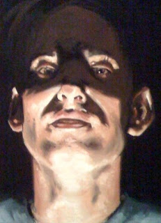
A self portrait


I'm really proud of this piece because I've was getting my butt kicked in my painting class this entire past semester. Nonetheless, Richard Houston, my teacher, really helped me understand how to approach oil painting from a more practical perspective. The key really was to understand the medium and how it works. Oils can be very tricky...and toxic. So this winter break Im hoping to toss a few more paintings together using all that I learned in his class..and when I do I'll post them too!

Sunday, November 9, 2008

Photoshop Magic


Movie poster project for Digital Design 1.

In the year 2006...


So in the process of applying to the Art Center College of Design I came across some old sketches from awhile back. What I like most about each sketch is that they were completely created without the aid of reference. Nowadays I find myself so dependent on reference that often times I wont draw without it. Reference adds a flare of realistic integrity to the picture.